Seasonal Indian mango brand, Windsor–Essex · 2025
Keri in Windsor
Brand direction, identity, packaging, campaign creative.
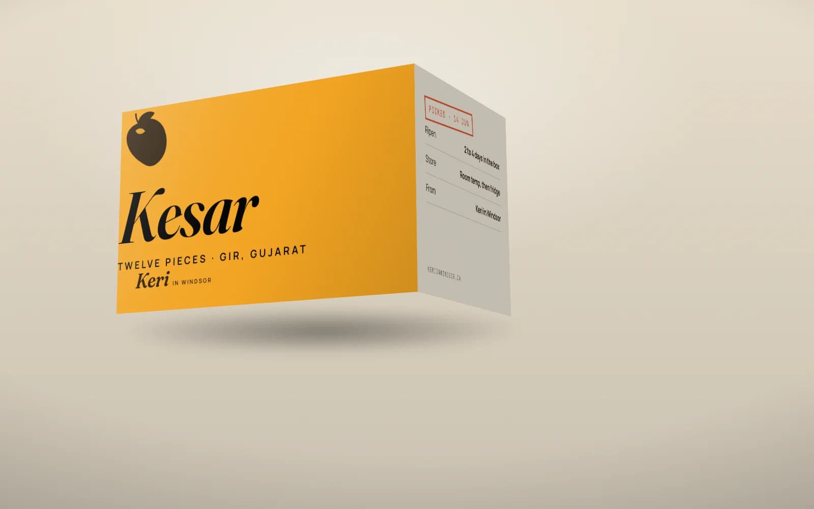
The idea
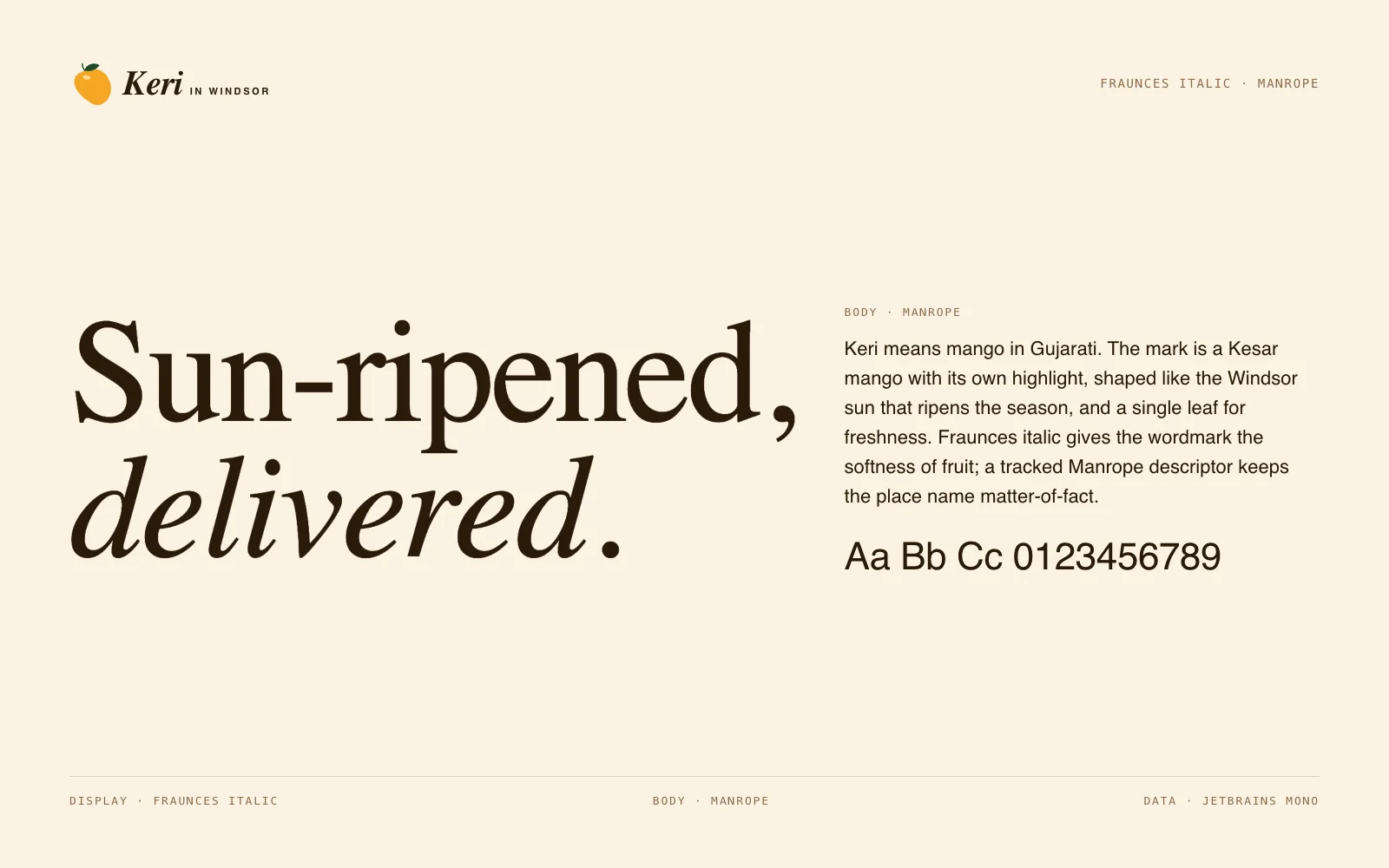
Keri means mango in Gujarati. The mark is a Kesar mango with its own highlight, shaped like the Windsor sun that ripens the season, and a single leaf for freshness. Fraunces italic gives the wordmark the softness of fruit; a tracked Manrope descriptor keeps the place name matter-of-fact.
Mark and lockup
Drawn once as vector and reused across every application. Clear space is half the mark's height on all sides.

120-unit grid · clear space
Colour
Named for what they are in the brand's world, not for what they look like.
kesar#F5A623
pulp#FFCB5C
leaf#1F4D2B
blush#E8562A
cream#FBF3E4
ink#2A1A08
Type
Fraunces Italic for the voice, Manrope for everything that has to be read.
Applications
4 pieces including the one above, each built from the same mark, palette and type.