Concept: a bakery in Windsor's oldest neighbourhood · 2026concept
Sandwich Town Bakery
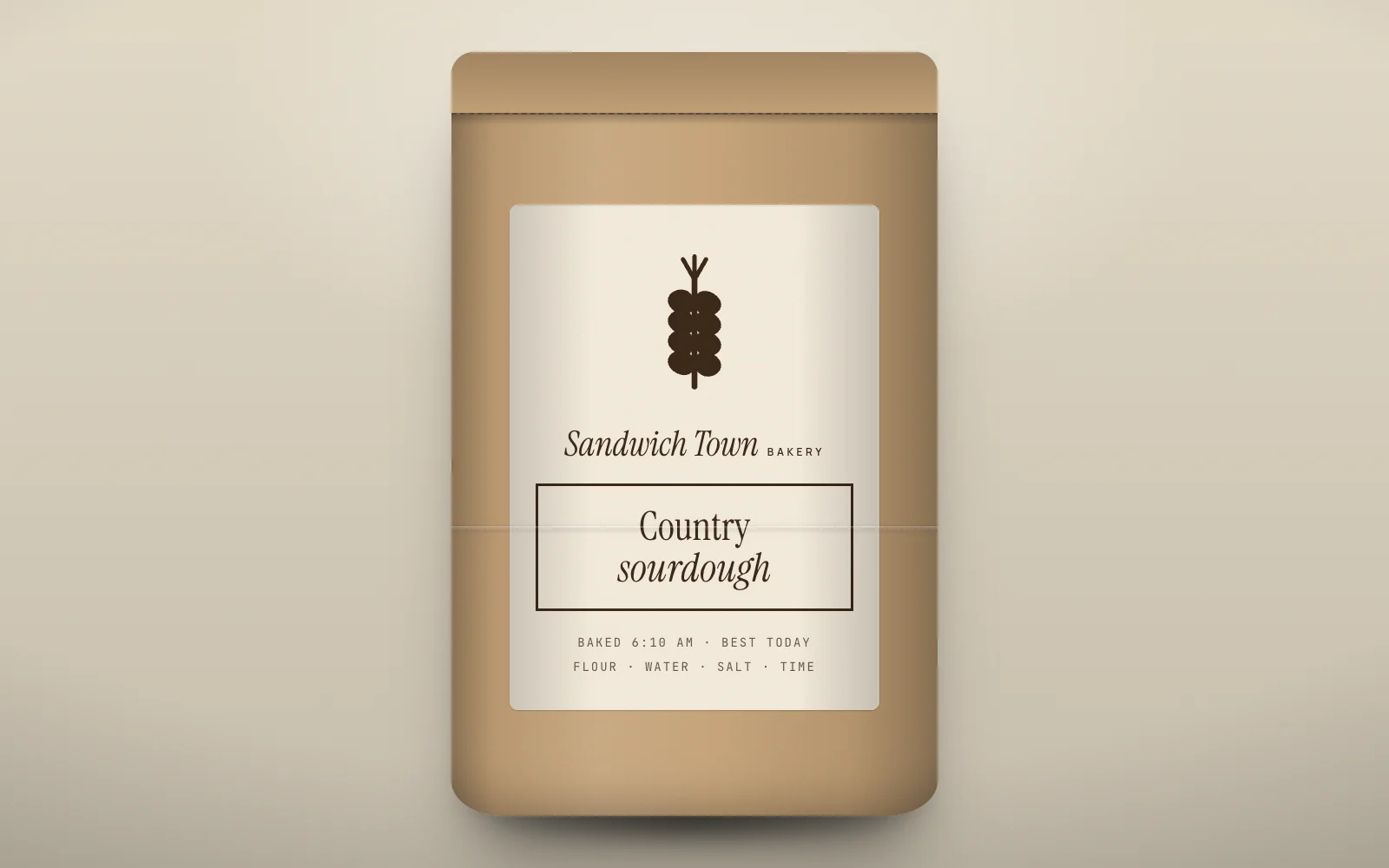
Concept identity, bread bags, storefront, coasters.
The idea
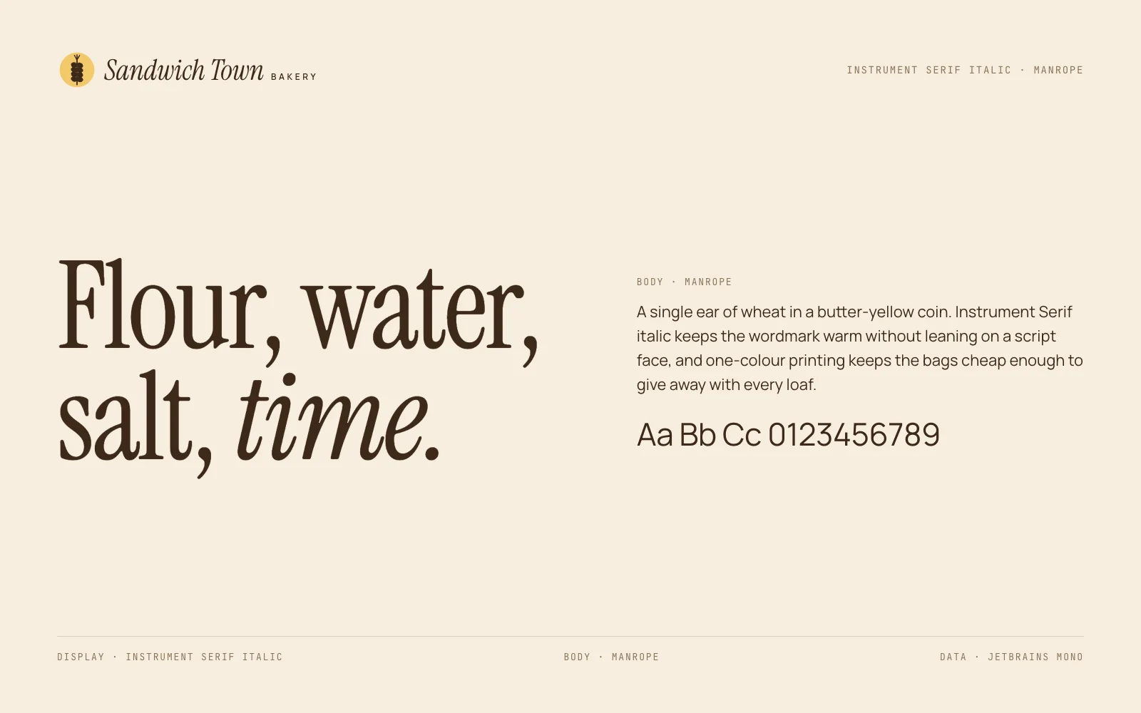
A single ear of wheat in a butter-yellow coin. Instrument Serif italic keeps the wordmark warm without leaning on a script face, and one-colour printing keeps the bags cheap enough to give away with every loaf.
Mark and lockup
Drawn once as vector and reused across every application. Clear space is half the mark's height on all sides.
120-unit grid · clear space
Colour
Named for what they are in the brand's world, not for what they look like.
crust#8A4B1E
flour#F7EEDF
rye#3D2A1A
butter#F3C96B
oat#D9C7A6
Type
Instrument Serif Italic for the voice, Manrope for everything that has to be read.
Applications
4 pieces including the one above, each built from the same mark, palette and type.