Light-routing puzzle for iPhone · 2026
BeamFall
Game identity, app icon, App Store creative, launch poster.
The idea
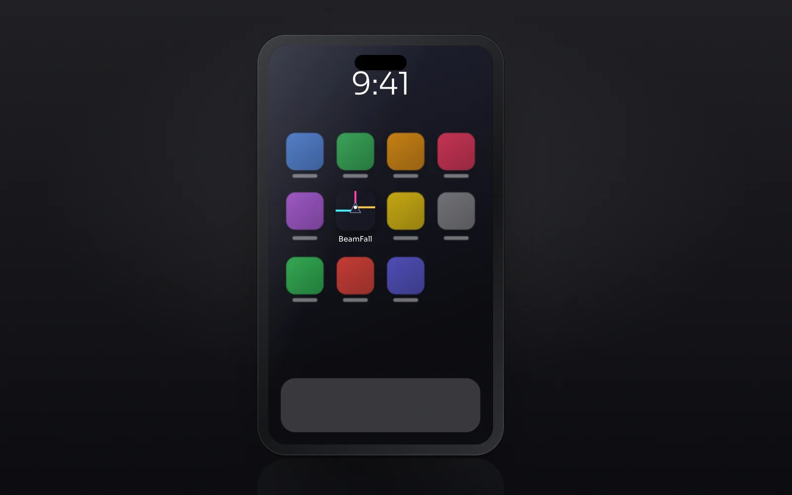
Three beams meet a prism. The icon is a literal game state: cyan enters, magenta exits upward, amber continues, and the white dot is the point where you tap. Unbounded at two weights splits the name into the beam and the fall. Everything on every piece is a real game element, so the brand never has to invent decoration.
Mark and lockup
Drawn once as vector and reused across every application. Clear space is half the mark's height on all sides.

Colour
Named for what they are in the brand's world, not for what they look like.
Type
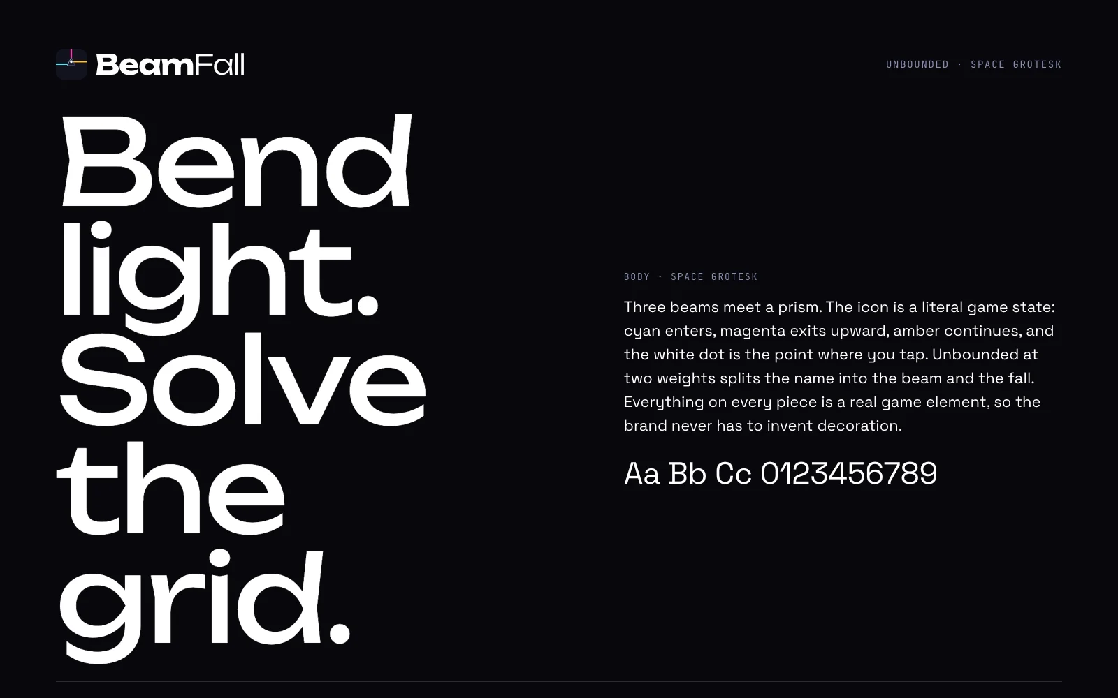
Unbounded for the voice, Space Grotesk for everything that has to be read.
Applications
4 pieces including the one above, each built from the same mark, palette and type.