Presence-aware desk robot · 2026
Dwello
Product and character design, logotype, expression system, packaging.
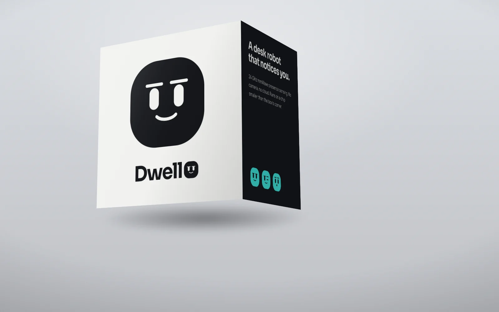
The idea
The last letter of the logotype is the robot. Its face uses the same geometry as the physical product, so the wordmark and the object look at you the same way. Expressions are parameters rather than drawings: brow lift, brow tilt, eye openness and mouth, and it is the asymmetry between the two sides that carries most of the feeling.
Mark and lockup
Drawn once as vector and reused across every application. Clear space is half the mark's height on all sides.

Colour
Named for what they are in the brand's world, not for what they look like.
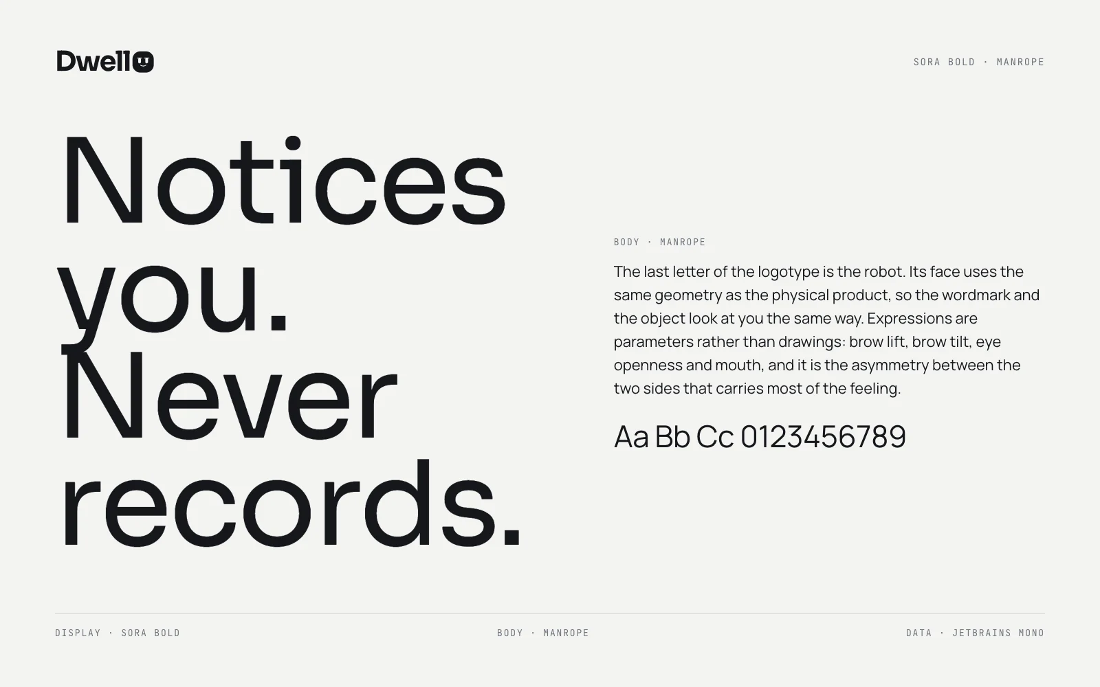
Type
Sora Bold for the voice, Manrope for everything that has to be read.
Applications
4 pieces including the one above, each built from the same mark, palette and type.