Concept: wayfinding for a Windsor–Detroit passenger ferry · 2026concept
Essex County Ferry
Concept identity, pictograms, wayfinding, tickets.
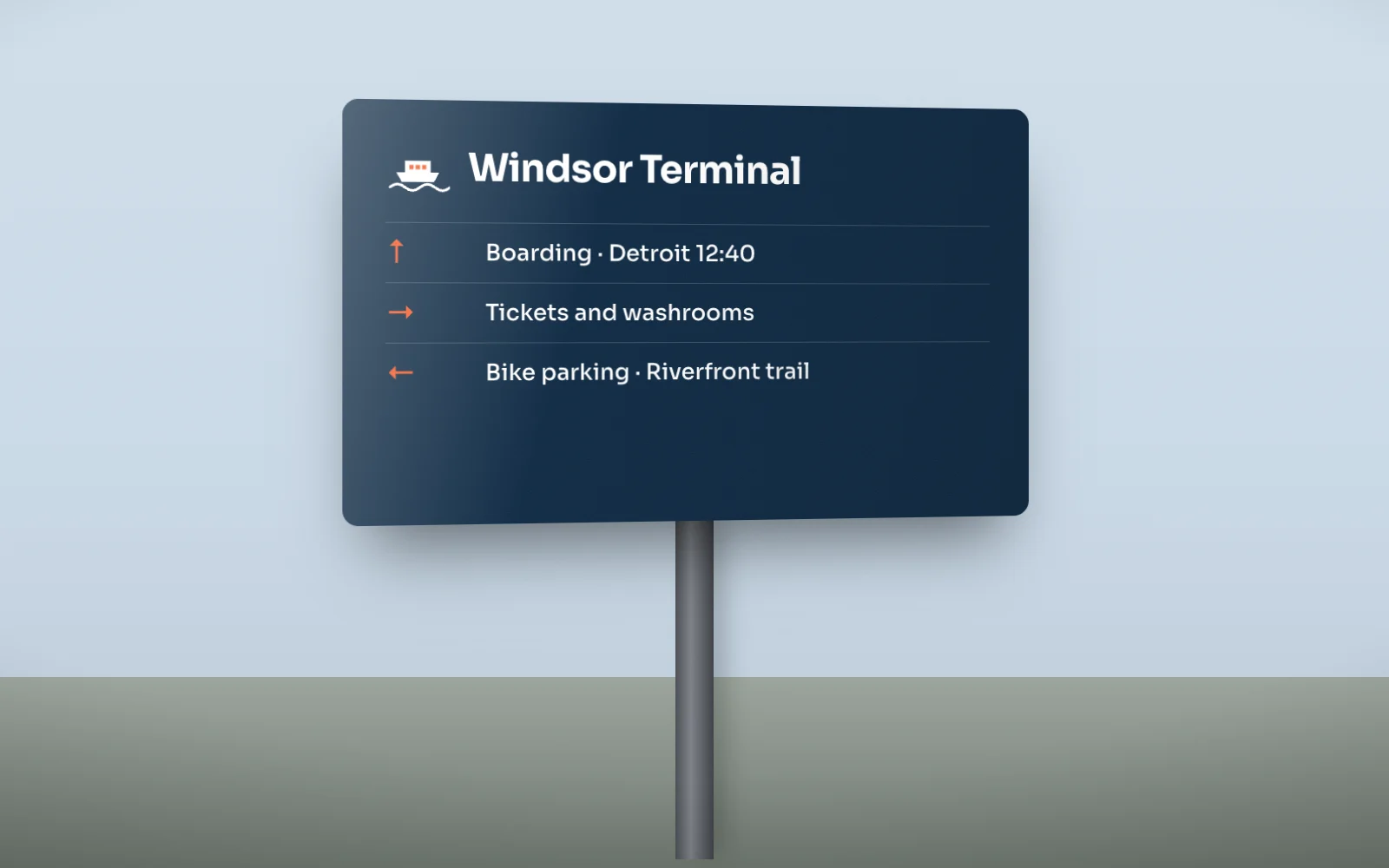
The idea
A ferry drawn on the same grid as the pictograms it sits beside, so the logo is the first sign in the system rather than a separate thing. Navy panels, one buoy-orange accent, and Sora at heavy weights for names you read from across a terminal.
Mark and lockup
Drawn once as vector and reused across every application. Clear space is half the mark's height on all sides.
120-unit grid · clear space
Colour
Named for what they are in the brand's world, not for what they look like.
navy#0F2A44
buoy#F25C2A
white#FFFFFF
mist#DCE6EE
river#2E6C8A
Type
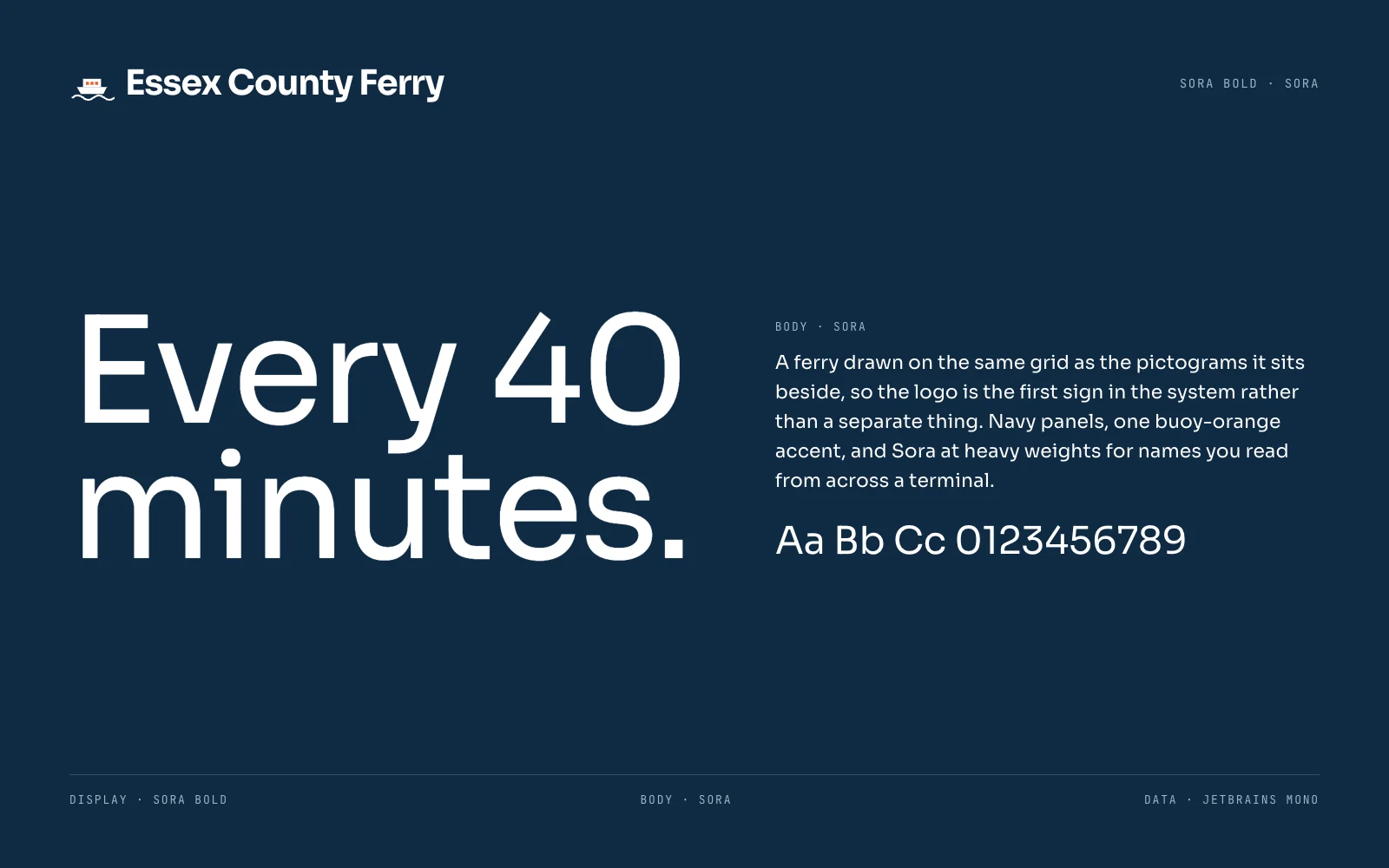
Sora Bold for the voice, Sora for everything that has to be read.
Applications
4 pieces including the one above, each built from the same mark, palette and type.