Concept: small-batch honey from Essex County · 2026concept
Tecumseh Honey Co.
Concept identity, jar labels, market signage.
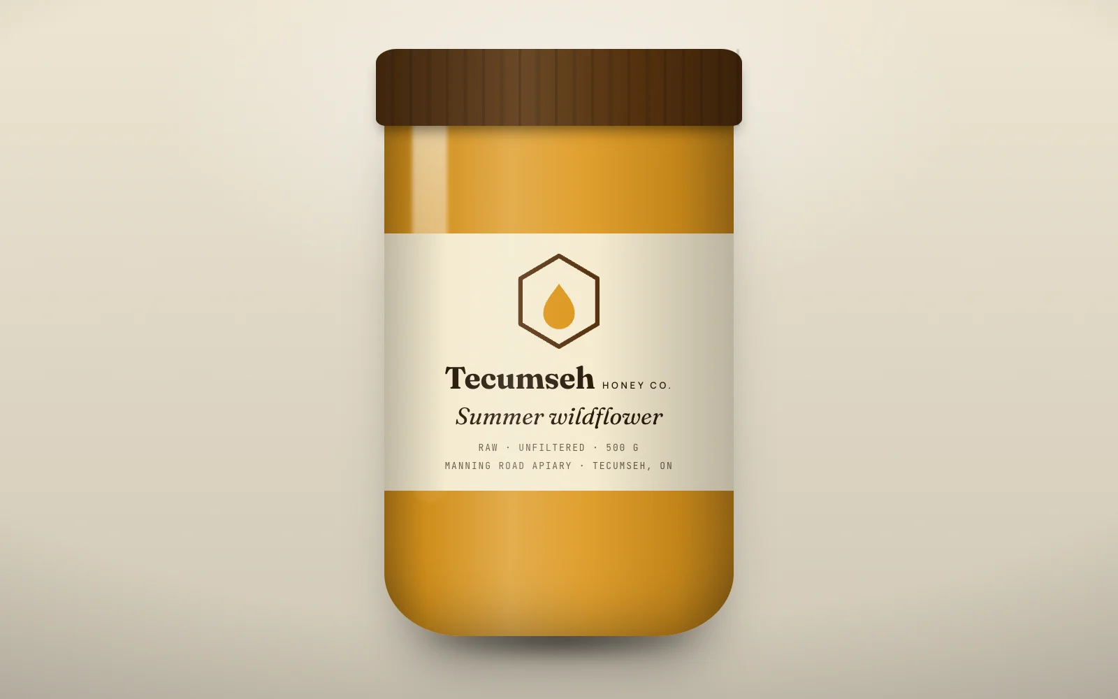
The idea
A hexagon that holds a single drop. Fraunces at its heaviest weight has the softness of honey without turning into a cartoon; the label lists the apiary's road because customers here buy from a place, not a brand.
Mark and lockup
Drawn once as vector and reused across every application. Clear space is half the mark's height on all sides.
120-unit grid · clear space
Colour
Named for what they are in the brand's world, not for what they look like.
amber#E39B1E
comb#5A3510
wax#FBF1D6
ink#2B1D0E
clover#7A8B4E
Type
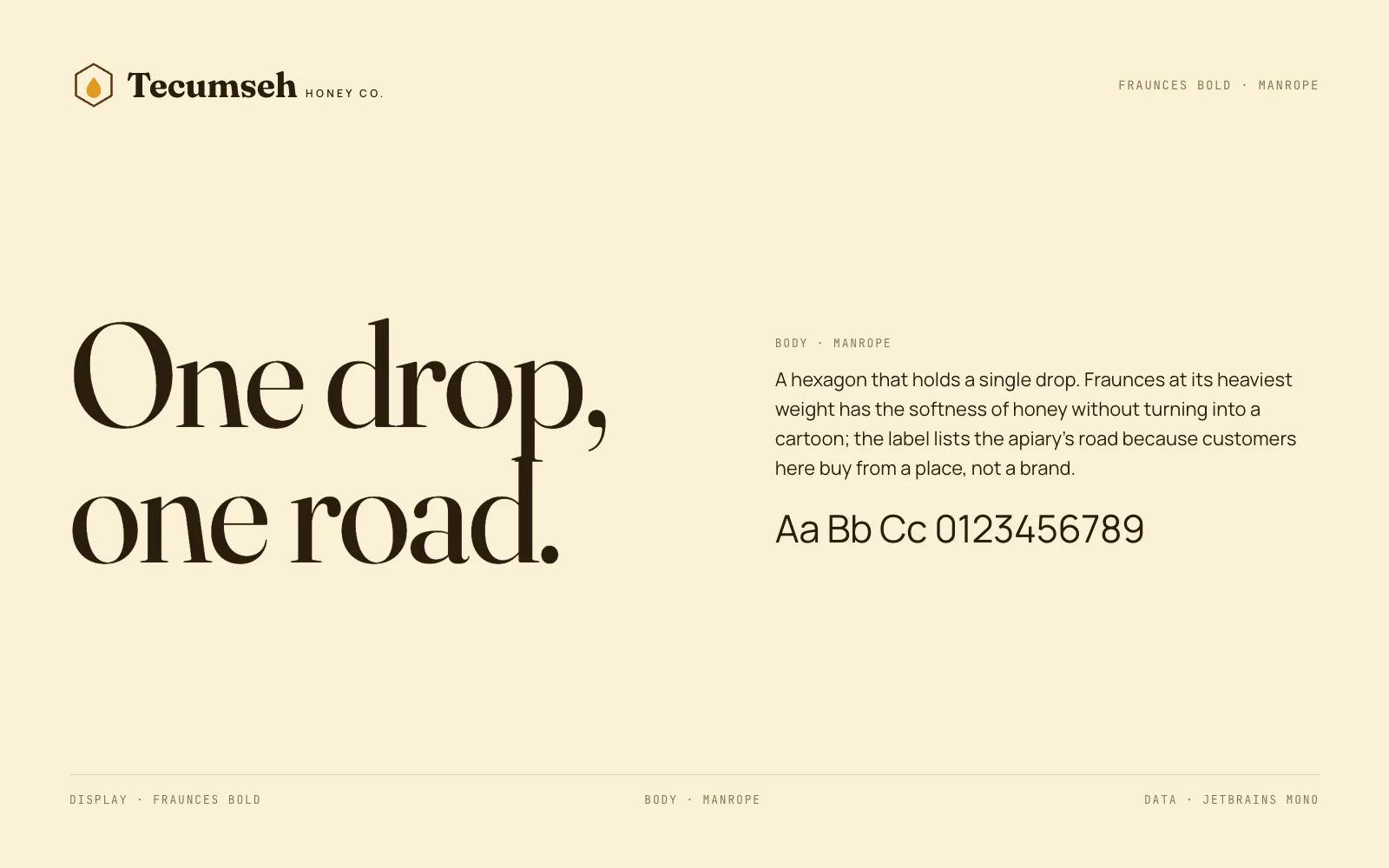
Fraunces Bold for the voice, Manrope for everything that has to be read.
Applications
4 pieces including the one above, each built from the same mark, palette and type.